Designing a modern digital platform for the constituents of Georgia

We knew we needed a solid, experienced partner like IDEO to design a state brand that reflected our values and build confidence amongst Georgians who interact with us across several digital channels.
Georgia is among the most populous states in the American South. It’s a place with a storied past and promising future—on the rise economically, and continuing its powerful cultural impact on music, TV, cuisine, and tourism. Over 10.4 million people call Georgia home, and nearly all of these people will at some point navigate the state’s websites for securing everyday services. Ideally, this online platform would provide unifying and accessible government resources for everyone, whether they’re renewing their vehicle registration, seeking a fishing license, or looking up tax law updates.

Georgia’s Office of Digital Services (DSGA), part of the Georgia Technology Authority, was challenged with designing a platform to modernize the collective and individual online presence of 80+ state agencies, many of which used visually disconnected formats and color palettes that could leave the public feeling confused. DSGA recognized that they could provide more efficient and higher quality service to the public if they simplified the language, designed the site from the user's point of view, and created a more cohesive look and feel across agencies.
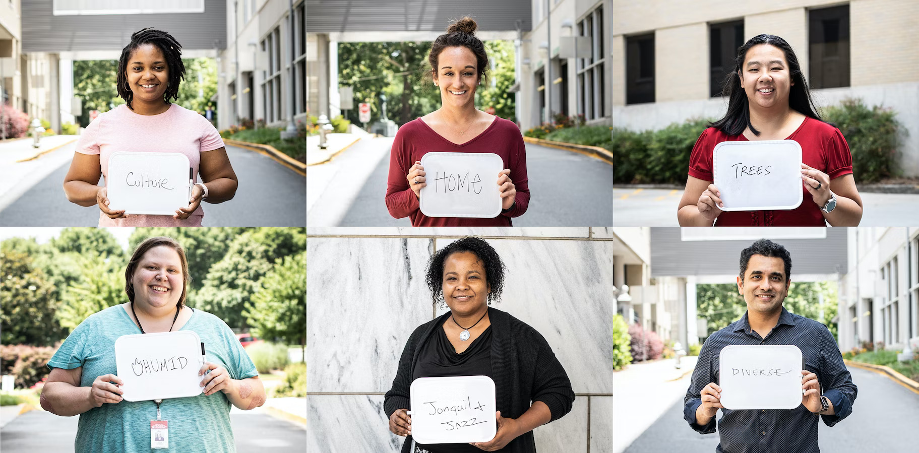
IDEO worked with the DSGA to identify the priorities of Georgia residents who use the various agency websites. On a road trip from Savannah to Atlanta, with stops in Macon and Dublin, the IDEO team immersed themselves in the rich culture of Georgia, connecting with social workers, low-income residents, state agency leadership and civic organizations to learn how Georgia’s digital properties could better address their disparate needs.
The design research underscored that there isn’t just one Georgia—it’s a tapestry of people, geographies and political orientations. Yet several common themes emerged, including:
Georgians want their government to “give it to them straight.” On the redesigned Georgia.gov platform, the people of Georgia can easily search popular topics to get the information they need. This includes learning how to apply for food stamps, renewing a business license, or simply finding out the location of a local office in their area. If a user has remaining questions, they can connect directly with a real human for further assistance, balancing direct information with warmth and a personal touch. User feedback on the site provides the opportunity for continuous design improvement.
Georgians want to take pride in the legacy and the future of their state. IDEO developed an entirely new design system with new navigational elements, fonts, and a color palette inspired by Georgia’s landscapes, all of which can be modified for individual agencies while remaining consistent with the state brand.

A distillation of the original Georgia seal adds authority, and new icons anchor the site’s menus and bring more clarity to the search function. The platform was designed to be Section 508 and WCAG 2.0 AA compliant, providing clear and accessible page content that adheres to federal laws and international web standards. To instill trust in Georgia’s online presence, each page also has a header that indicates it’s an official Georgia State website and outlines the uniform features constituents can use to identify this.

With improved navigation and easy-to-access prioritized content, Georgia.gov is a much more efficient platform for addressing requests from citizens. The site projects a happy-to-help, citizen-centered approach that aims to empower all Georgians so that they feel confident, informed, and prepared.
Press stories
Curious about how this kind of thinking could benefit your organization? We’d love to hear from you.
Subscribe

.svg)


