9 Travel Hassles We’re Dying to Redesign
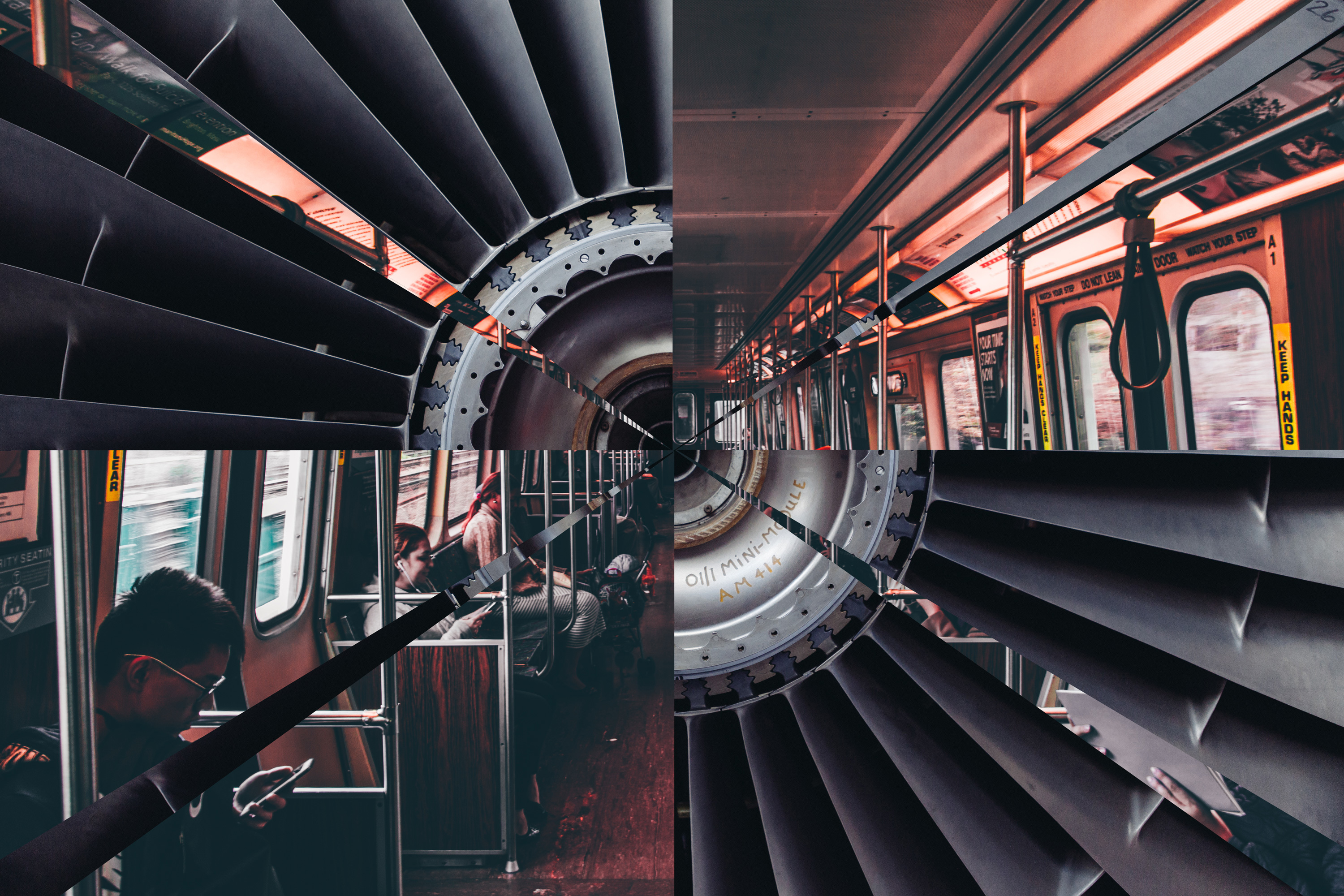
Just in time for the busiest days of American travel, our designers put their heads together to imagine a future of seamless transit, complete with inflatable car seats and airplane sleeping pods. IDEO already does forward-thinking transportation design with partners like Ford, Lincoln, Lufthansa, and major airports. But transportation is a sprawling industry, and there’s always plenty more to do.
Here are nine travel experiences we’d love to redesign:
GETTING THROUGH AIRPORT SECURITY
Taking our shoes off to go through security? Gross. But the most stressful moment for me is when my stuff comes out the other end of the scanner and I have to grab it in a rush because someone else's stuff is right behind and my toddler is running in the other direction. Then we waddle over to a corner with all our belongings splayed out and try to make sense of our luggage again. There has to be a better way!
Then there’s all the time wasted. Could there be a way to check wait times for security lines—similar to a traffic report—so I know how far in advance I need to arrive at the airport? IDEO designers are already working with the staff of a major Canadian airport to make their screening process smoother, faster, and less unpleasant. Let’s keep the good ideas rolling!
—Sally Sosa, IDEO San Francisco
THE PLANE BOARDING SHUFFLE
I’ve noticed a weird social phenomenon: Everyone gets up when the first people start boarding a plane, even if they have three boarding zones ahead of them. The zones are arbitrarily assigned based on when passengers checked in and how much extra money they wanted to pay—a legacy system based on someone's obscure definition of loyalty and status, plus assertiveness. That means that if someone in Zone 2 gets into an aisle seat, but I'm in Zone 4 and have the window, everyone has to get up, get out, shuffle down the aisle, let me in, and then sit down again. It's entirely inefficient. Also, if I have no overhead carry on and can breeze off the plane, facilitate that. I've never met anyone who actually likes this system. Airlines are leaving money on the runway—literally.
—Denise Burchell, IDEO San Francisco; Shuya Gong, IDEO Cambridge
Airbus' modular plane concept. Source: The Verge
FLYING ECONOMY CLASS
I used to work for Emirates, Singapore Airlines, and Qantas, so I have a vision for the ideal plane cabin. In economy class, you get shoved into an uncomfortable seat next to a guy who hogs the armrest. This is painful for people like me who usually take long-haul flights. (I fly 15 hours from Dubai to Sydney twice a year to see family.)
Why not reconfigure economy class with bunks for passengers on flights longer than four hours, so that people can actually relax or sleep? Do away with the overhead lockers, increase the checked baggage allowance, and allow passengers only one small carry-on unless they’re traveling with kids or a baby. Designate time slots for people to get meals, which they can order beforehand or through the in-flight entertainment system, letting flight attendants better organize their work. You could also automate the system of delivering meals to passengers instead of pushing a trolley down the aisle, which blocks me from getting to the bathroom while an indecisive passenger is trying to figure out if he wants a Sprite or a Coke.
While we’re at it, have a kids' section where they can play without annoying everyone else, and include something like the in-flight nanny service Emirates already offers. Have a nursing area where mums can feed their babies without people bumping past them, or change their babies without having to juggle the kid, a dirty diaper, a fold-down table, and a diaper bag in a bathroom without enough room to swing a hamster, let alone a cat.
Check out this image of a crew rest area on an airplane; the stewards have room to lie down and snooze, while not being dear on space. With just a little imagination, you could make these into seats that fold flat and include easy-to-clean access, since cleaning the airplane between flights takes longer than anything else. The specs of an Airbus A380 would make this setup totally possible!
—Asja Simunovic, IDEO Munich
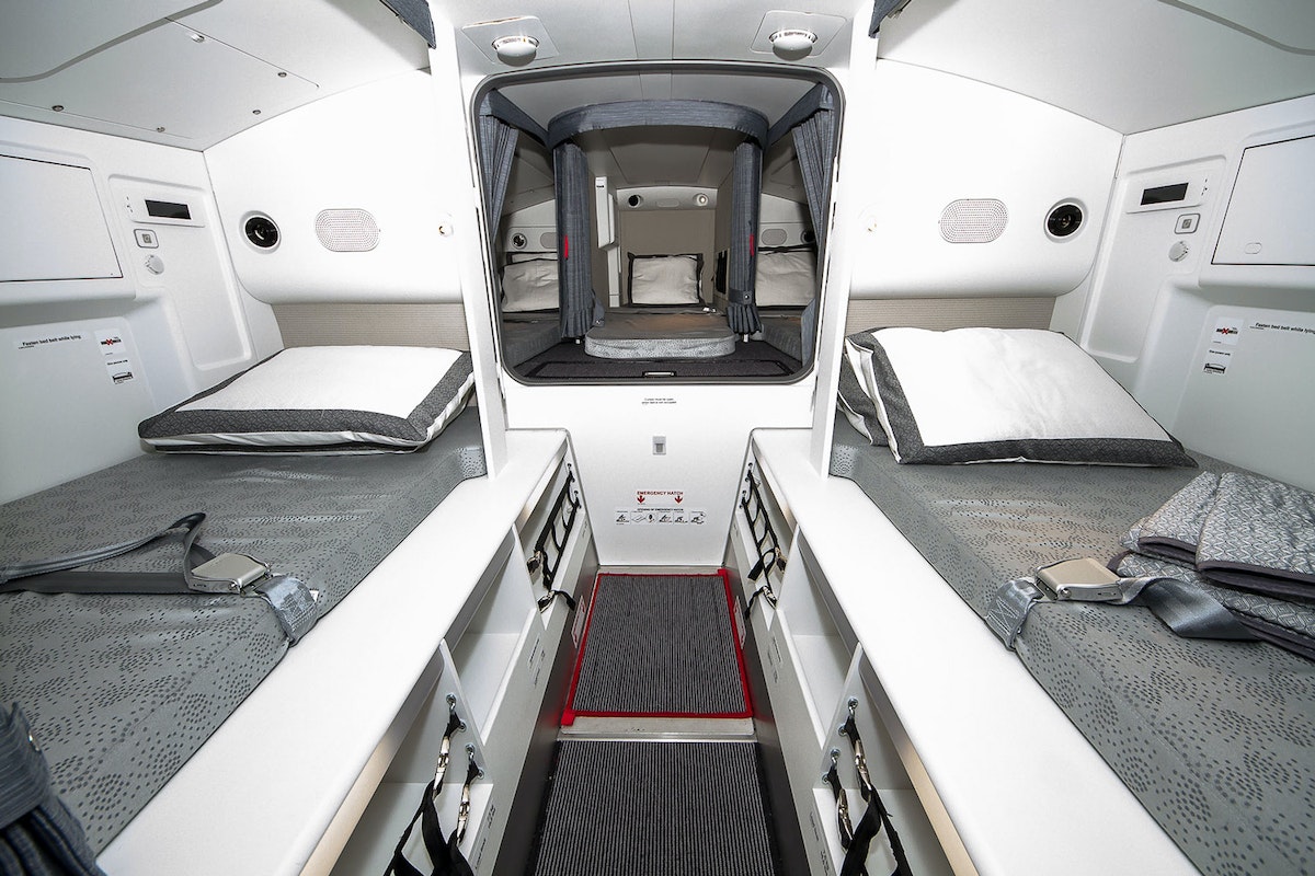
Qatar Airways Airbus A350 crew rest area.
RIDING THE CROSS-COUNTRY RAILS
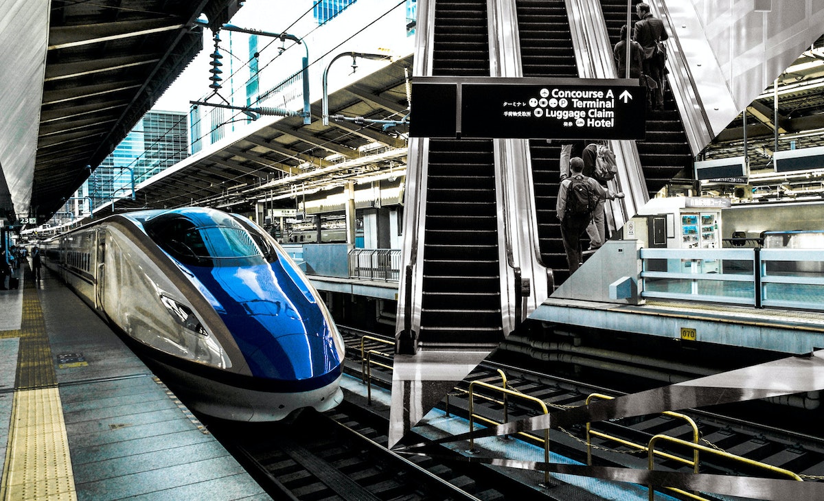
Two years ago, I took a long train trip from Chicago to New Orleans with my wife. She’s Danish. I’m Turkish. We have a lot of experience with train travel in Europe. It was shocking to see how sad train conditions are in the U.S. How might we redesign the experience of the Great American Railroad? We can utilize all our design chops—from data to spatial to UX—to do so. I’d love to take the lessons I’ve learned from IDEO’s relationship with Ford and apply them to train travel to make an impact on a more economically and geographically diverse community.
—Dogan Sekercioglu, IDEO Chicago
TRAVELING WITH A KID (AND A CAR SEAT)
It’s so annoying to travel with a car seat. I avoid it at all costs, and then end up trying to rent or borrow one, which is never convenient. It's also a pain when I want to do something like take the train into the city and then take a taxi to a part of town that’s too far to walk to with a toddler.
How about a packable, maybe inflatable, car seat? Can you imagine how great it would be if you had a small, portable car seat you could just throw in your bag?
—Kim Powers, IDEO San Francisco
BOOKING A NATURE GETAWAY
I want to redesign the way we book campsites. The current system is really challenging to navigate, particularly for outdoors neophytes. It's opaque and cumbersome, and there's no way to release sites for last-minute booking. I'd love to design ways to make the process simple, intuitive, and experiential.
Shouldn't a booking site feel welcoming and fun? Couldn't it show you what kind of hike to expect on the way to your campsite and what the views are like? If it’s a car camping site, how noisy is it? How about real-time weather so you know what to pack, or a map showing how close your site is to amenities like bathrooms or a store? What if it included ratings from other campers? Let's make our parks and forests more accessible, especially to those who aren't experienced outdoors people.
—Kate Lydon, IDEO San Francisco

DODGING TOURISTS IN THE BIG APPLE
New York City sees more than 60 million visitors a year, and locals know that with tourists come clogged sidewalks, long lines, and dozens of confused subway riders. As a New Yorker, I’m also struck by how seldom visitors tend to go outside the typical destinations—a.k.a. Midtown and the usual suspects. I love how distinctive each neighborhood of New York City is, and the unique culture, food, and experience each offers.
I know we can do a better job of moving people around the city so that visitors have a better experience. I’m inspired by this initiative the city of Amsterdam is using to distribute, rather than limit, the flows of tourists. Amsterdam encourages tourists to visit outlying areas and see popular attractions at off-peak times. Why can’t we? IDEO worked with the TODAY show to design a seamless experience for the street audience at Rockefeller Center; we can put some of those same techniques to work at a larger scale.
—David Boardman, IDEO New York
NAVIGATING THE URBAN LANDSCAPE
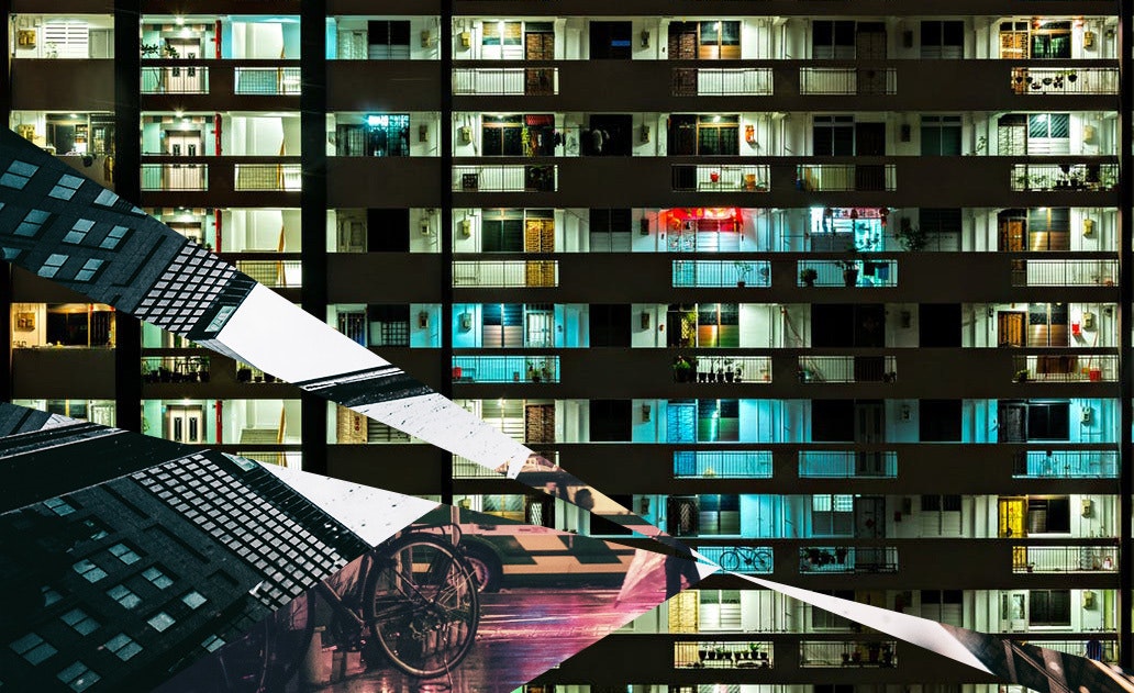
I would love to see a well-designed urban infrastructure that allows for driverless mobility, makes cycling and walking safe alternatives, and accounts for a broad span of ages and physical limitations.
Right now, multimodal transportation is not synced. Urban dwellers need various types of transit to get around, from trains to buses, but none of them talk to one another. There's so much focus on driverless cars, which is great, but we also need to seize the opportunity to encourage more active mobility by creating more car-free zones for safer walking and biking, for example. Both protected bike lanes and central bikeways would encourage more safe cycling in cities.
In general, street signage is not all that helpful or appealing. Might there be a way to not just wayfind, but also add delight? Signs could provide more than just basic information, such as interesting historical tidbits about the city, the number of steps between signs, or digital messages on sidewalks or in other unexpected places. People could also track their city journeys via an app on their phones to show where they've been, and get recommendations for where to go next; their urban journeys would become living maps.
—Margaret Kessler, IDEO San Francisco
PAYING FOR PARKING DOWNTOWN
Parking lot pay machines are poorly designed. They’re often covered with lists of instructions and homemade signs taped on by the operators and owners trying to show customers what to do and in what sequence. The machines need to accept credit cards—with a stripe in one exact orientation—bills, coins, and of course parking tickets with a magnetic stripe in one orientation, too.
I like how the parking garage at San Francisco International Airport allows you to use FasTrak to avoid a paper ticket. Maybe ticket machines could use Apple Pay or another pay-by-phone service to avoid credit cards and cash, or better yet, use pay-by-phone services in your car on the way in and out of the lot so you can avoid the ticket machines entirely.
—Dennis Boyle, IDEO Palo Alto
Want to reimagine transit with us? Contact Madison Mount (madison@ideo.com) at IDEO’s San Francisco studio.
Words and art


Subscribe

.svg)


