How to Design a Meeting That Doesn't Suck

“Oh god, not another meeting.”
Yes, we know, communication is important. But most meetings end up feeling more like black holes in your calendar—rote check-ins that suck up more energy than they create. And just as with black holes, we who design meetings may not observe how bad they are directly, and only observe their effects—frequent phone checking, a battle to sound like the smartest person in the room, zero follow-through. So, how do you reinvent a workplace ritual so that it truly inspires? Here are 3 tips:
1. Create agreements, not rules
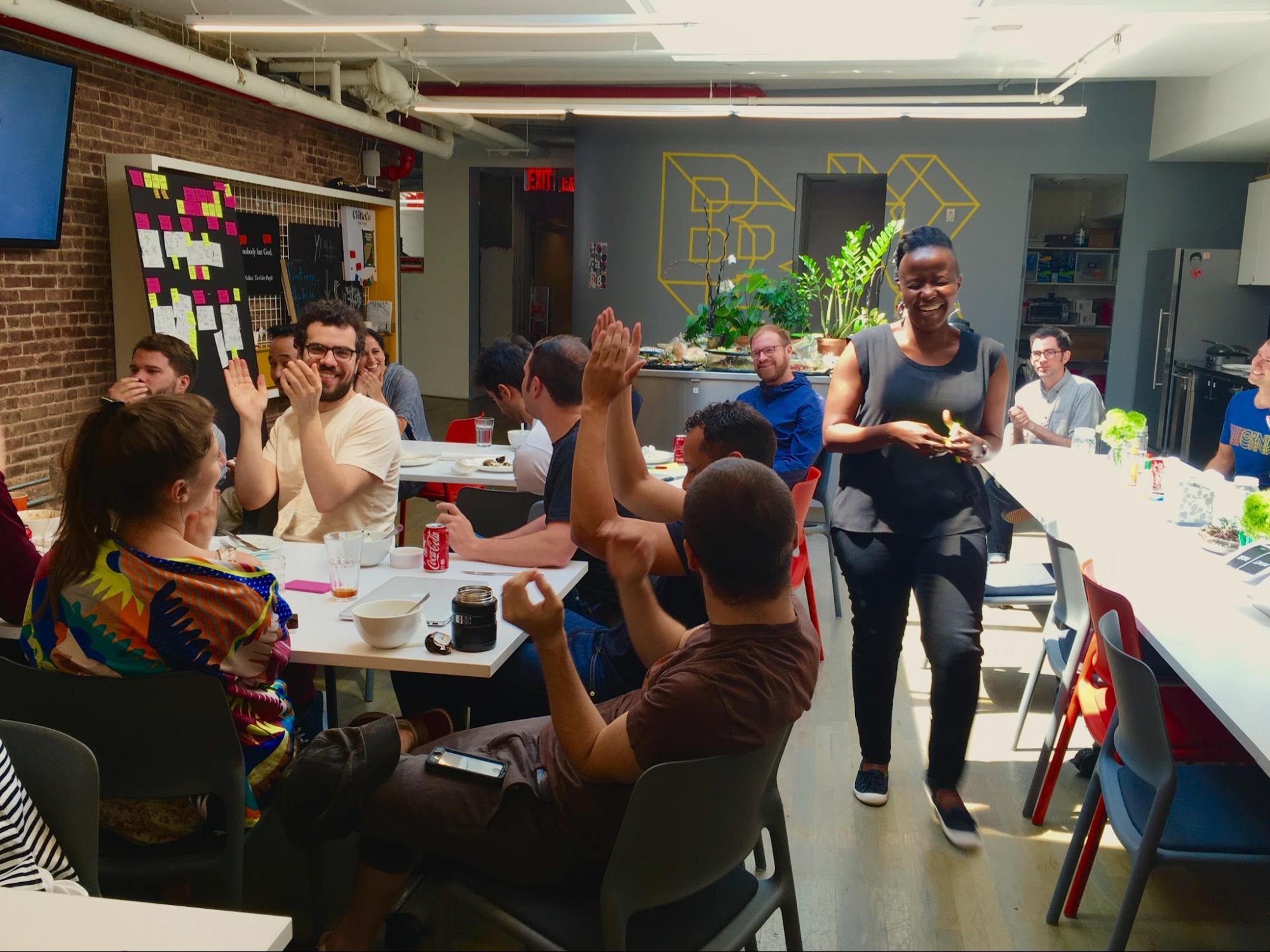
For our weekly bits&bites meeting about the intersection of digital and creative technology, we decided to carve out five minutes from an existing office-wide gathering—our weekly Monday lunch—and offer the mic to anyone who wanted to talk about a piece of digital wizardry that's really rocking their world.

For the open mic share to catch on, we created a set of agreements that was structured enough to describe to people what and how to share, yet loose enough to encourage them to take risks.
- Whatever excites you, excites us. Pick a topic that combines digital with another craft, discipline, concept, or anything else that you’re passionate about.
- Keep it real. Talk about something that you either use, or would have loved to design.
- Keep it short. Remember, you only have five minutes! Keep it simple—don't overthink it.
- Take initiative. Interested in presenting? Add your name to the calendar!
- Take ownership. Once you’re up, you’re up. If you can’t make it, find someone to take your spot.
2. Design and brand it
Create a distinctive identity. In this world, even meetings need a brand to maintain their appeal. To make bits&bites really stick, we came up with a name, a look, and a jingle, and turned to our community for a design boost. Writer Jason Baker took inspiration from the bite-sized format and lunchtime milieu to come up with the moniker. Communication designer Peter Antonelli lent his talents to a simple, eye-catching visual identity. And design researcher with musical talents Alex Gallafent composed a catchy theme song, seemingly extracted from a 1980s science show. Taken together, the attention paid to designing this meeting has made bits&bites an exciting familiar moment every week (we often catch people absent-mindedly humming the jingle around the office).
3. Make it interdisciplinary and inclusive
Invite people from across disciplines. Our intent for bits&bites was to shift our thinking from digital as a craft to digital as a medium or mindset. This lens prompted people to share work that explored questions like, what does digital mean when it overlaps with the idea of delight? Or protest? Or the sense of touch? How can we explore digital in the context of analog experiences? What lies at the nexus of digital and fright? The interdisciplinary approach not only made the bits&bites meeting more robust, it turned what could have been a closed door session with a few into an inclusive event.

We’re now entering our 9th month of this inspiration part of our regular lunch meeting. We’ve accumulated some of our favorites here, including Selma Durand’s “Digital Magic”, which celebrates digital illusions within industrial design, and “Hello World Wide Web” from Fuzzy Wobble, which looks at the rich history of firsts since the Internet began. Check out this slideshow.
Words and art


Subscribe

.svg)


