Using Code and Wood to Make Data Tangible
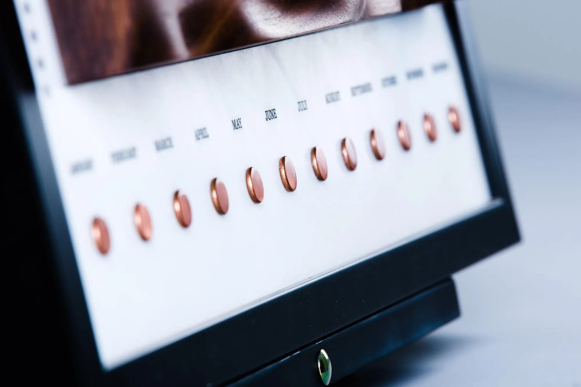
As an industrial designer, I’m always eager to bring together the digital and the physical. So when I discovered that the Chicago studio was collecting data about their energy usage, I decided to create a project that would make that information feel real, teach me more about other disciplines, and serve as a gift to the studio that had hosted me as an intern for half a year.
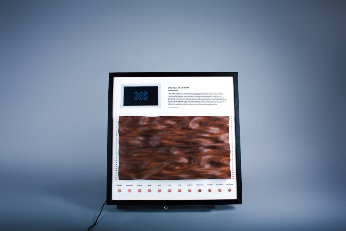
Because usage is tied to a period of time, a digital calendar with interactive feedback seemed like the perfect way to represent a year in the life of the Chicago studio. There would be three elements to it: a milled piece of wood whose undulating shape would represent changes in energy usage over time; an interactive display that would show usage in more detail; and a set of buttons that would let users call up specific data on the display.
The Code
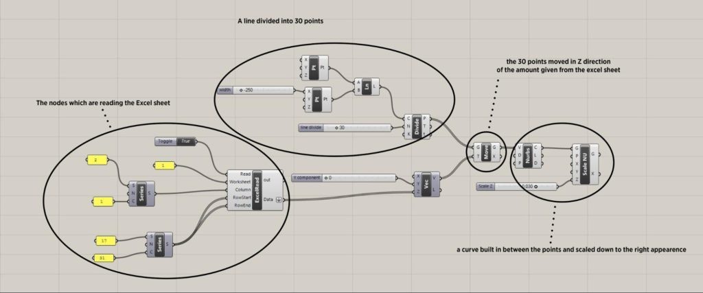
This is a tricky project for someone who doesn’t know anything about coding let alone a programming language. I had to figure out how to manipulate the usage data using tools from my life as an industrial designer. I started with Grasshopper, a visual programming language and a plugin for the 3-D modeling software Rhinoceros that I learned how to use as an undergrad. Instead of writing code, you connect boxes of different abilities to each other. By connecting the boxes with each other, I was able to pull in the data from my Excel spreadsheet and convert it into 3-D shape; then it was ready to work within Rhinoceros. Because Grasshopper is a plugin for Rhinoceros, you can see what you’re doing as you go. After some long nights, I figured out how to display the data in a 3-D shape.

Prototyping
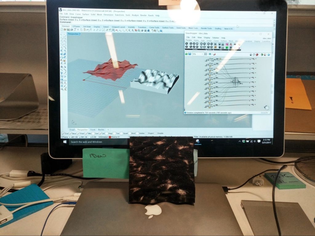
With the code all set, I moved on to creating the touchable surface. I made some quick 3-D prints of the data I created in Rhinoceros, then made a low-fidelity video prototype to display how the installation would look and work. The idea was to let the user feel the changing data via a touchable surface, and give him/her a visual representation of the data on the screen.
Build Phase
Step 1: Milling the wood
The touchable interface was the main piece of my installation, so it was crucial to get it right.
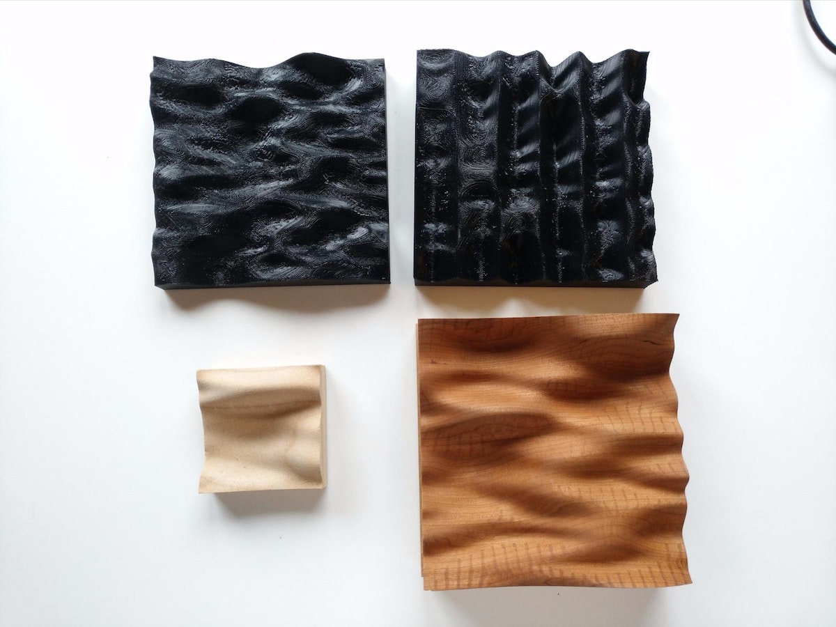
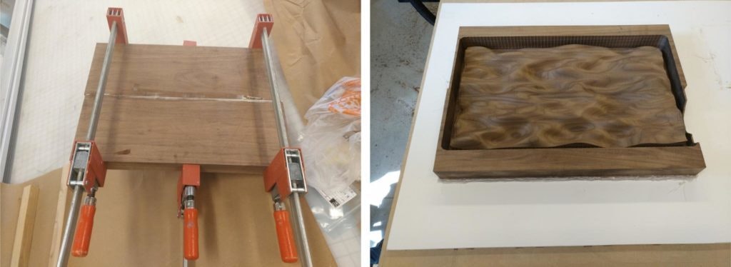
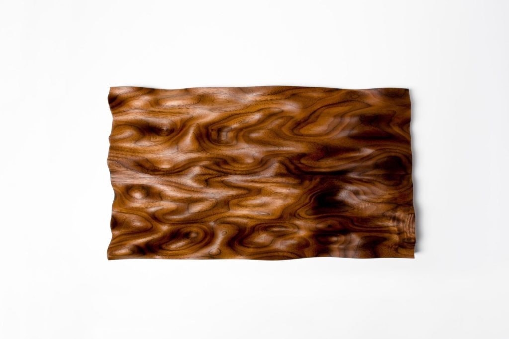
I bought one long piece of walnut and used the table saw to cut it to the length I needed, then glued the resulting pieces together. I created the undulating surface with a CNC table mill, which took roughly 10 hours. It was loud and dusty, but worth it. To get the perfect finish, I had to sand it — a lot. I probably could have stopped earlier, but I wanted to have a perfect piece. Then, I rubbed it with Danish oil to protect the surface and bring out the wood grain.
Step 2: The visual feedback
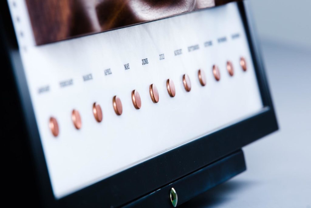
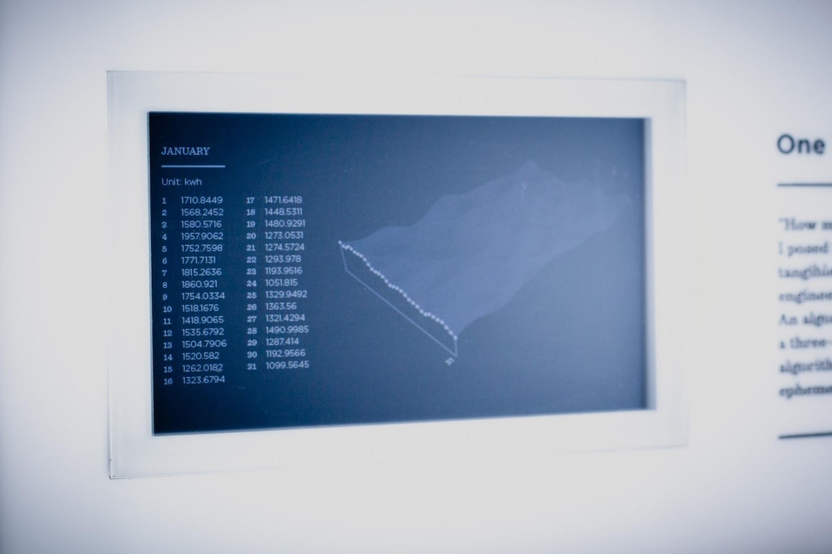
To create the visual feedback, I used a Raspberry Pi, a capacitive touch board (MPR121), a 7” HDMI screen, wires, and some copper rivets. With no experience with Raspberry Pi or electrical engineering, I had to catch up quickly. To display the data on the screen, I used a handy piece of code I found on the internet called PiPresents. For input, I used capacitive touch buttons, which I linked to specific images that display the data.
Step 3: Panel assembly
This step was one of the harder parts. I had to bring all the different pieces together and create the framed panel. I started with a cheap frame from an art supply store, then created an acrylic, laser-etched back panel, spray painted it black, and sanded it to make it matte. Next, I attached the wooden panel to the screen, and connected the 12 capacitive touch buttons, one for each month, arranged along the long axis of the wooden surface. Once everything was in place, users could feel the wood to get a sense of our changing energy usage, then touch the buttons to see a drilled down explanation of the data by month. About a month and a half after I first came up with the idea, it was finally ready to present to the studio.
A big thank you to the whole studio, especially to Chris Gold for helping me during the milling process, Rob Rehrig for giving me a Raspberry Pi 101, and Sophie Feng for taking awesome final pictures and video. Want to recreate the project? Check out the code on Github.

Get in touch


